Stints' case study
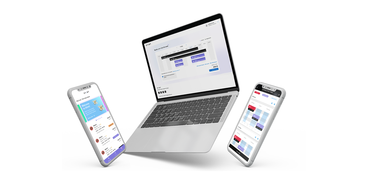
New mobile app redesign (released September 2022)
Stint connects you with Stinters who’ll work for as little as two hours at a time, allowing you to improve your customer and team experience, whilst keeping your costs under control.
The challenge
Stints aimed to create an enhanced version of the app within a 3-month timeframe. To align with the latest branding, the decision was made to develop the MVP using Flutter. The app's user base was also expanded to include a wider audience, beyond just students. Despite the limitation of utilizing older back-end technology, the product team capitalized on the opportunity to make user experience improvements based on insights gathered from the previous version of the app.
Below are a few points I wanted to tackle in the new design.
- Improve conversion for onboarding flow to reduce drop-offs
- Offer more than one Stint offer to the users
- Update the UI to the latest branding for consistency
My responsibilities
- Create the new design system
- Collaborate with the other design on producing new users flow, user testing and ideation.
- Produce all the UI for the mobile app
Our approach
We held a series of workshops to improve the app. In the initial workshop, the team identified all the features of the current app and classified them as need to have, nice to have, or no. Following this, the team created user flows to further refine the app's functionality.
Old onboarding userflow
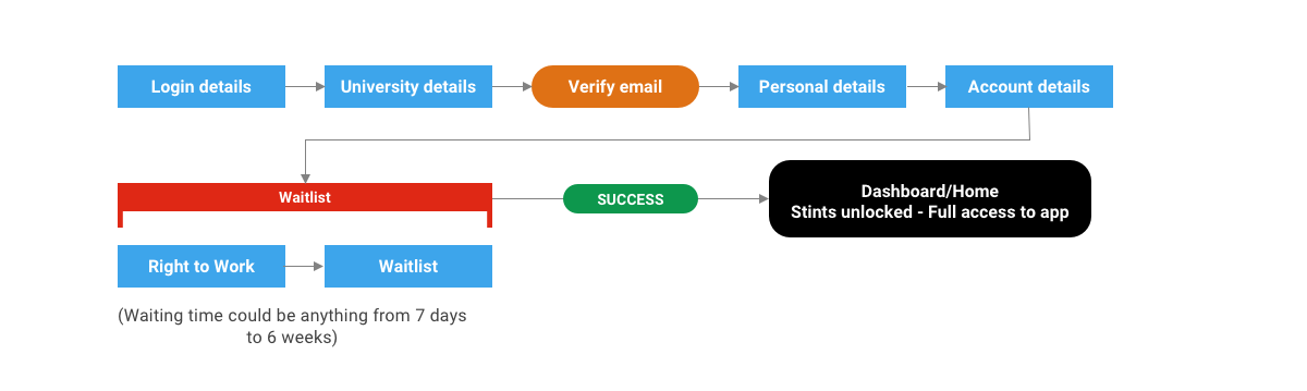
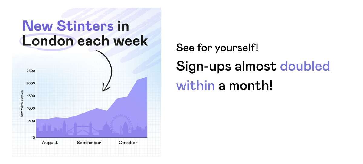
The previous onboarding process had a rigid, linear structure. This caused users to fill out multiple forms and return to the app to check their progress, leading to a high drop-off rate. More than 50% of users abandoned the process before reaching the home page/dashboard. Through interviews with those who dropped out, it was discovered that they found the process to be too lengthy and that there was a lack of information provided on their progress. Some users even believed the app had malfunctioned.
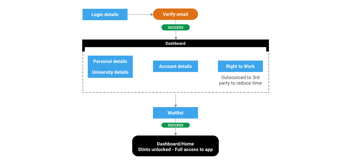
New onboarding userflow
I proposed to my team that we streamline the sign-up process to quickly onboard users into the app. To engage users, I proposed an interactive experience that educates them on the next steps. I then created wireframes and flows to support this strategy.
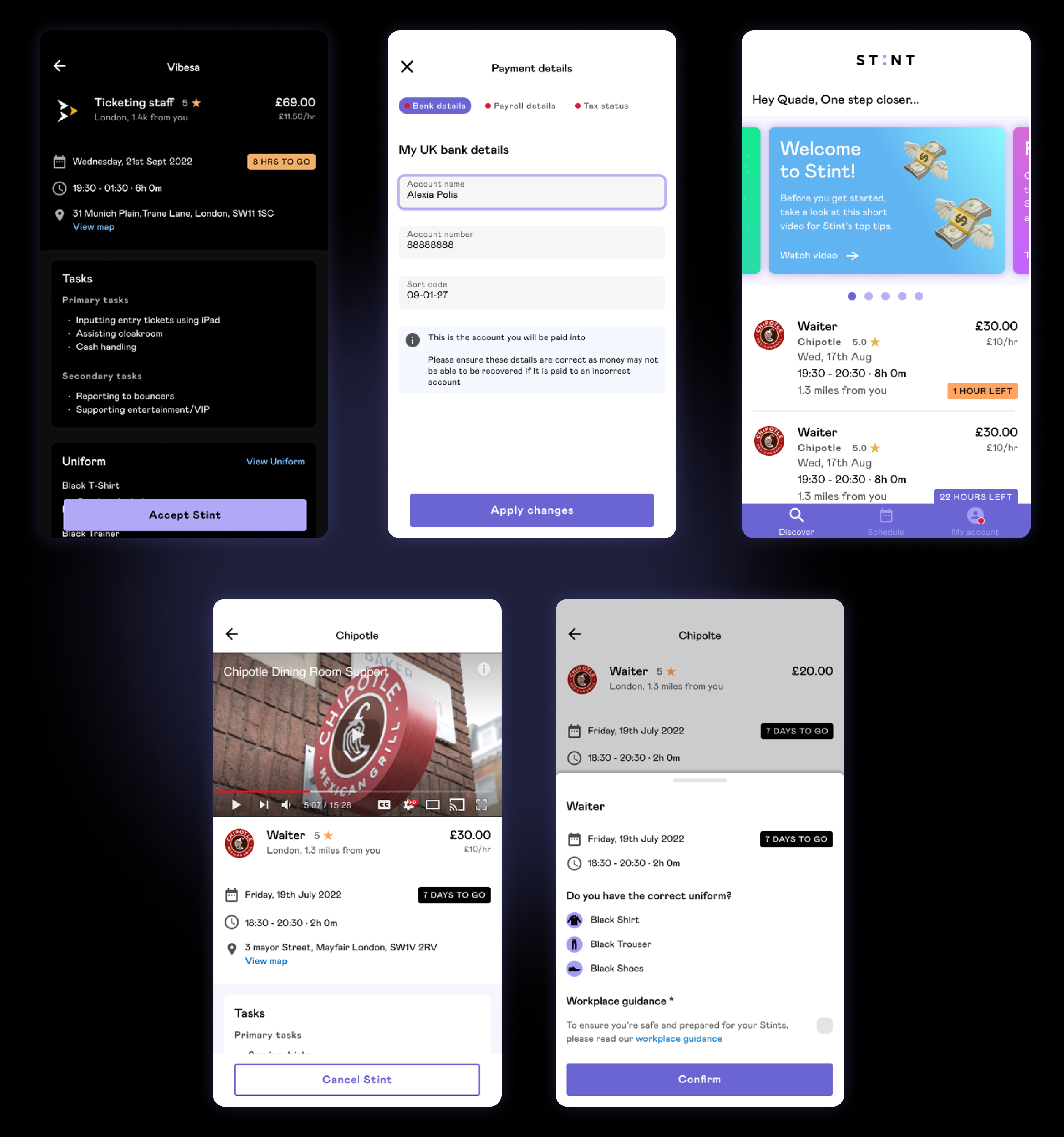
UI Design
I have created an updated onboarding process with a carousel feature that provides users with clear instructions on the next steps. The carousel also allows for the promotion of Stint's offers and other engaging content, to improve user experience and engagement.
Results
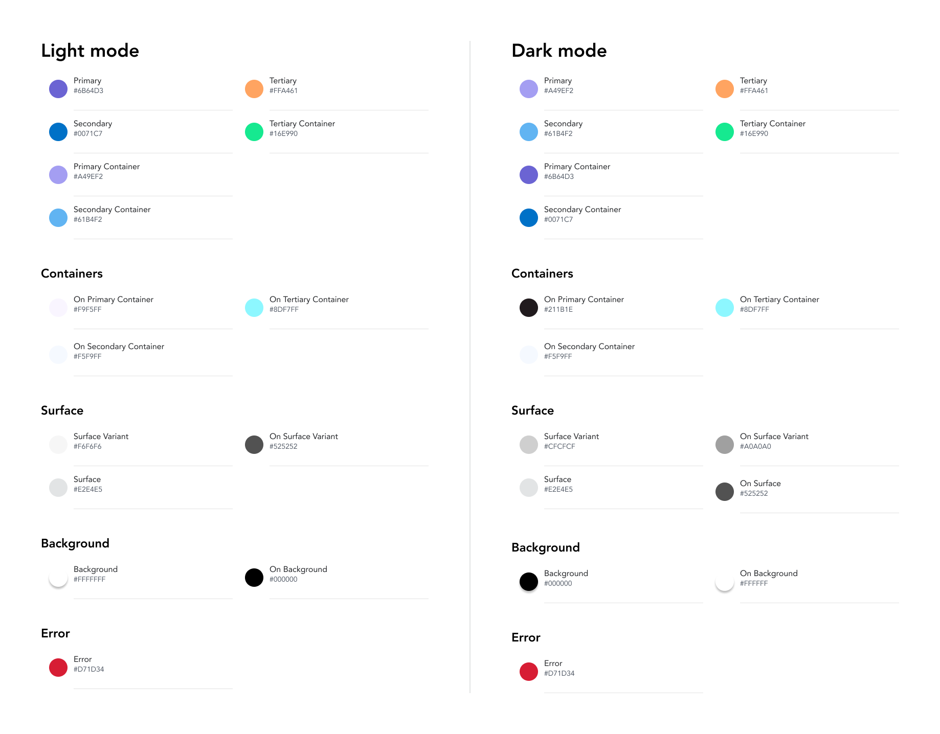
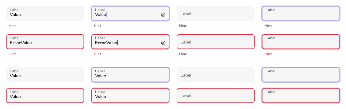
Design System
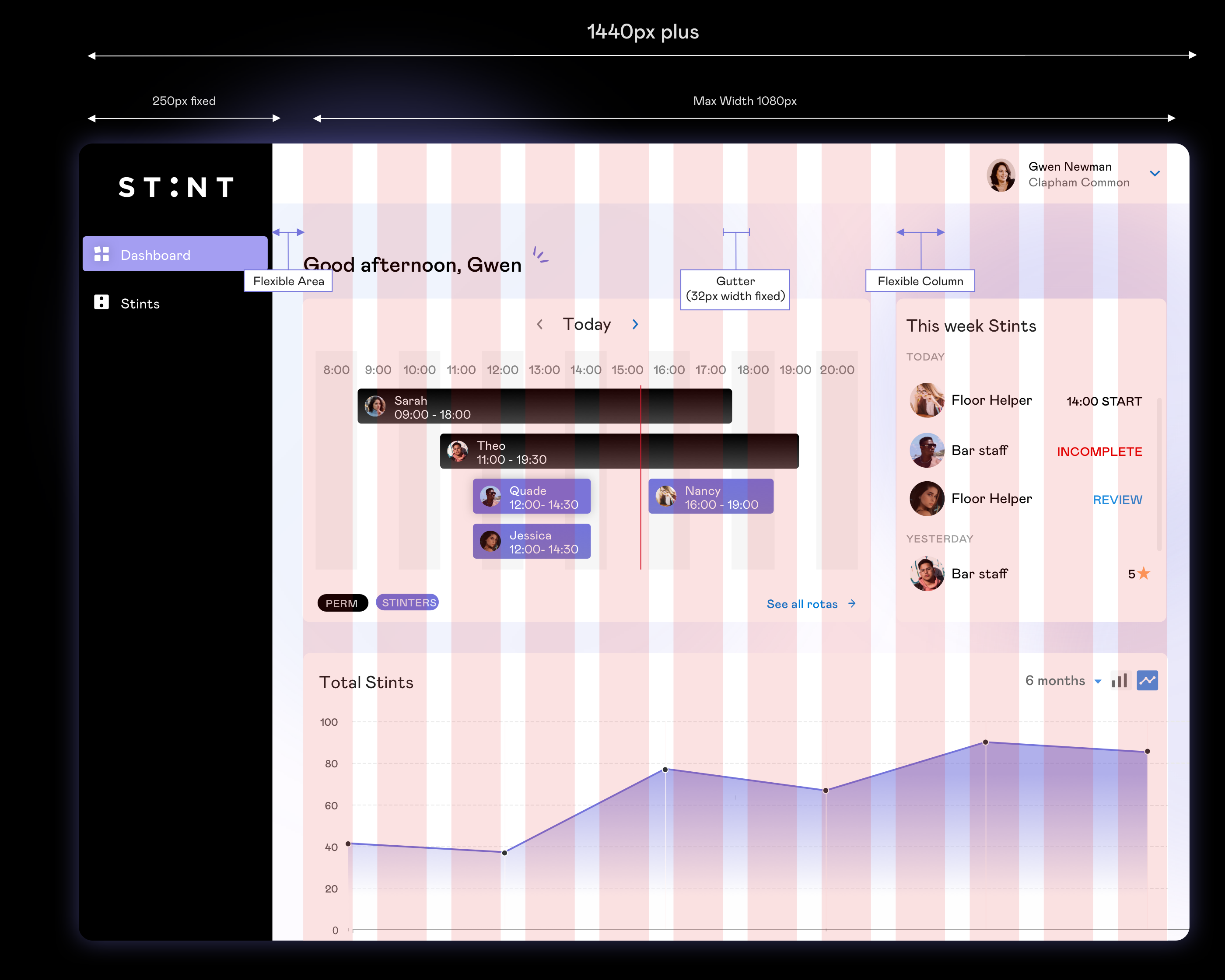
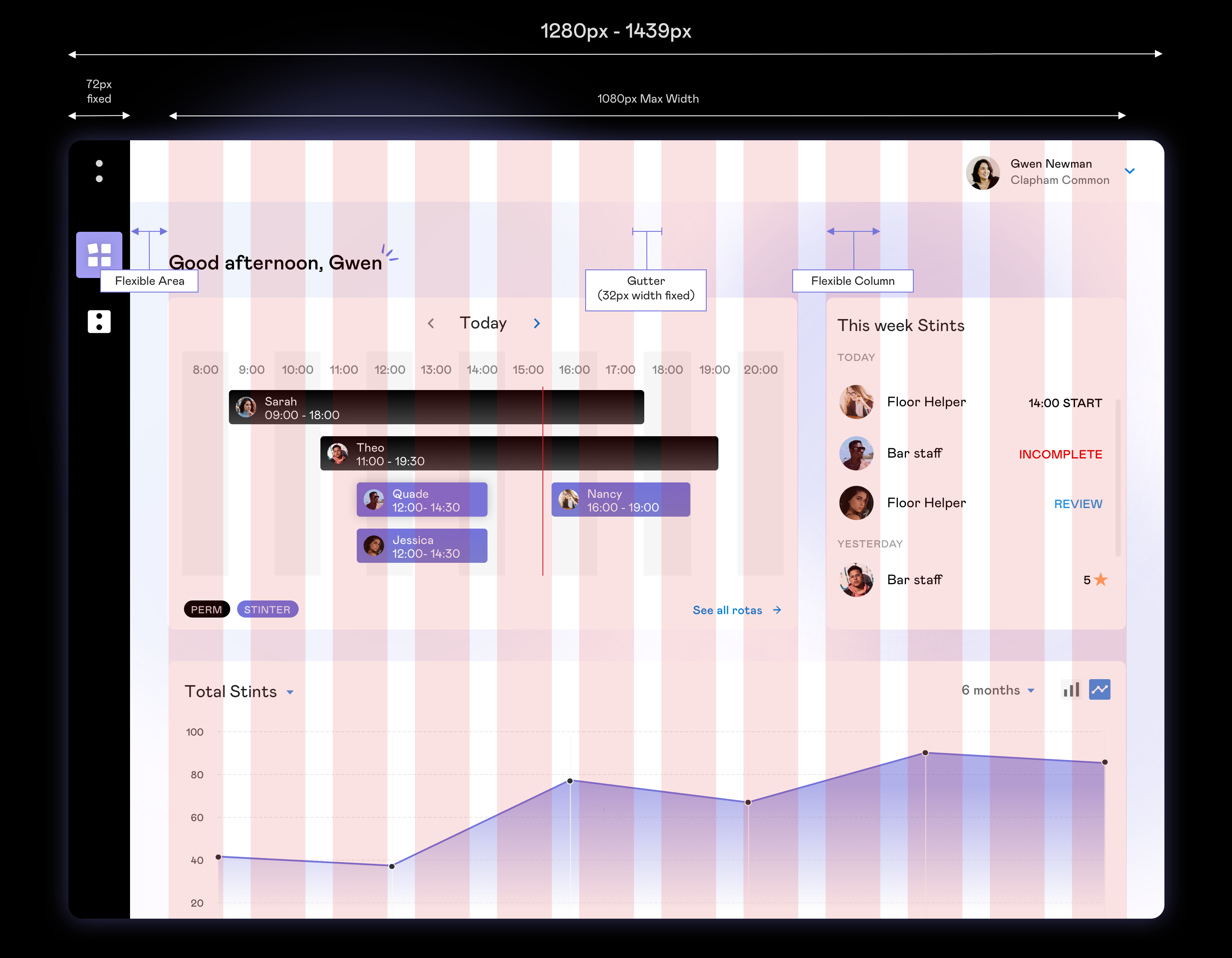
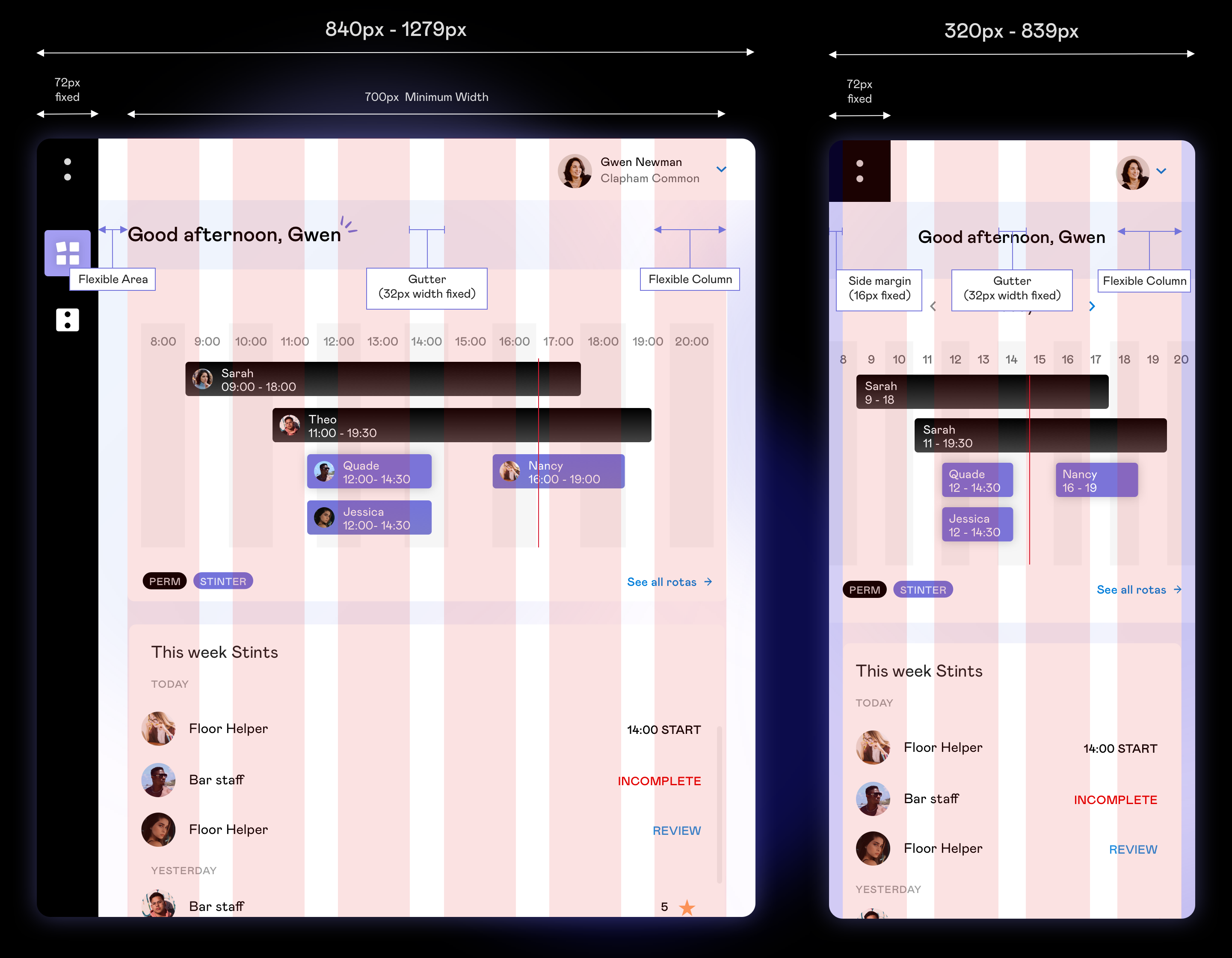
I developed a new pattern library for Stint, based on Material Design 3.0 guidelines and incorporating the latest branding of the company. I also made sure to include a dark mode option, which can be controlled by the user. I used design tokens and typography tokens to ensure consistency and flexibility in the design elements. Furthermore, I made sure that all designs met WCAG AA standards for accessibility. This pattern library will be used as a foundation for all design elements and interactions within all the apps, providing consistency and cohesiveness throughout the user experience. Additionally, it is responsive and mobile-friendly, allowing users to access the app seamlessly on any device. Below are a few glimpses of the Design System.
Design token - Foundations