myGPs' case study

Mobile app redesign

myGP is the number 1 healthcare app in the UK, it has over 1 million active users.

The challenge

myGP wanted to refresh the visual design making it more appealing and consistent. In addition they wanted to improve the overall user experience and add new product and services to the app.


The redesign


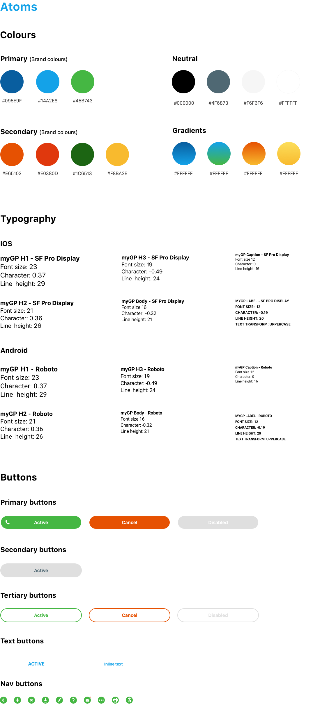
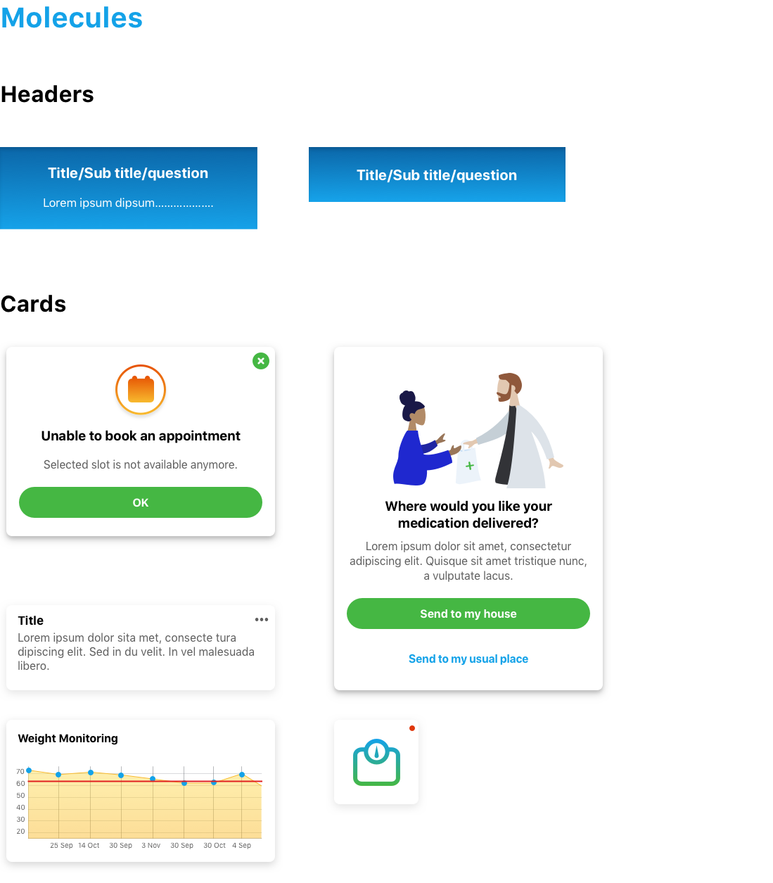
I have created a pattern library for iOS and Android using an atomic design system to improve the design of the current app. This will improve the visual language and get rid of the inconsistencies and accessibility design failures in the current design.

UI/UX designs
UI/UX designs
UI/UX designs

Dark mode - iOS 13


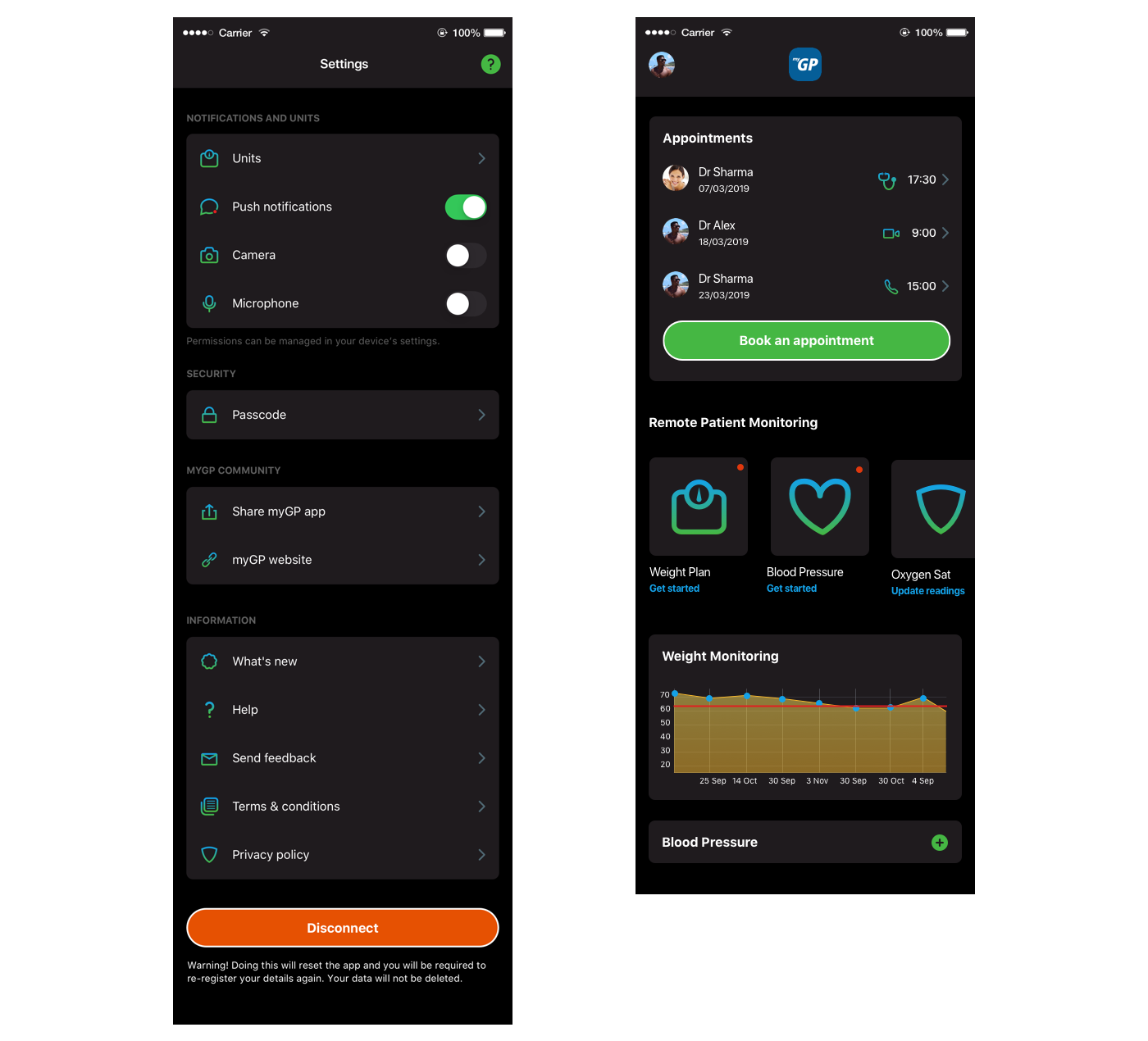
I designed the app for iOS and Android. Below is an example of native app design for iOS 13 - Dark mode.

UI/UX designs
UI/UX designs

User experience design

Adding dependents redesign

The challenge

Many users had difficulty adding dependents to the app due to lack of information. After looking at the current user-flow I took the following steps to improve the user experience.


Hi-fi prototype and guerrilla testing

After my analysis and setting my objectives I decided to create my user flow directly in Proto.io using the new pattern library. After I had completed this I carried out some guerrilla testing on 5 people. I found that the new user-flow was a lot more simpler to use and completely reduced confusion.

Below is a video of the prototype showing the new user-flow.

Web app

The challenge

I was asked to create a feature for booking appointments on the myGP website. Below are the requirements for this task


Creating the user-flows

I created wireframes/designs and mapped out the user-flows using Miro so I could collaborate with the rest of the product team. Once this was finalised I created a medium prototype for guerrilla testing.

PREVIOUS CASE STUDY
NEXT CASE STUDY